Overview
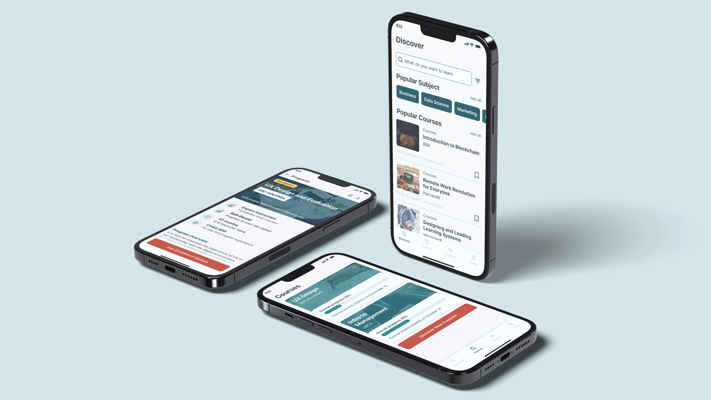
The Home Depot mobile app is exactly the copy of the website, due to that reason some parts feel too overwhelming for a mobile app. In addition, the whole mobile app feels outdated. The idea of this project is to redesign THD mobile app by refreshing the layout, font, icon, and overall user clarity to create a modern look. Also by selecting and displaying information as needed
List item 1
List item 2
List item 3
Role
UI Designer
Skills
UI Design, Prototyping
Tools
Figma
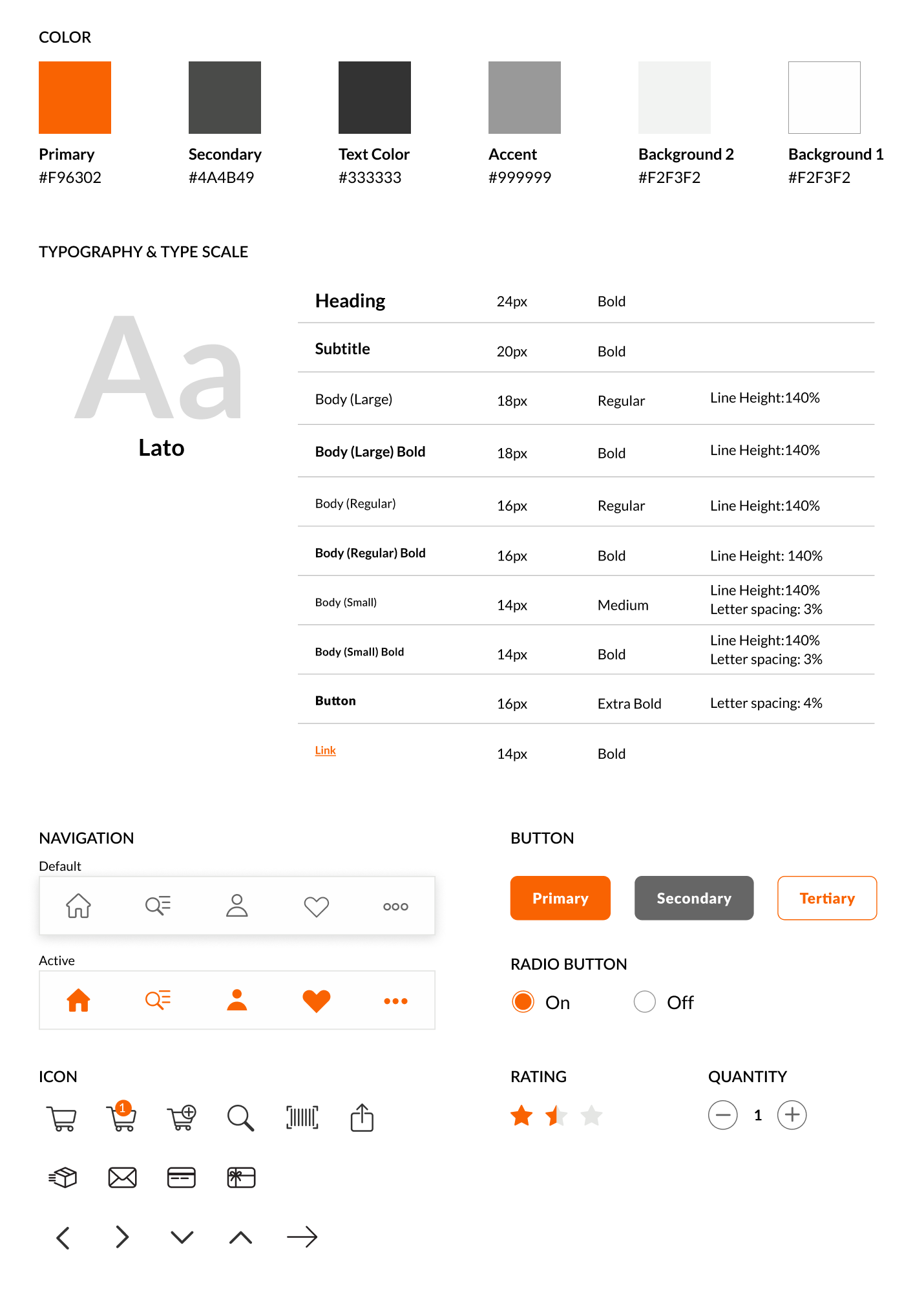
New UI Kit
Current vs Redesign

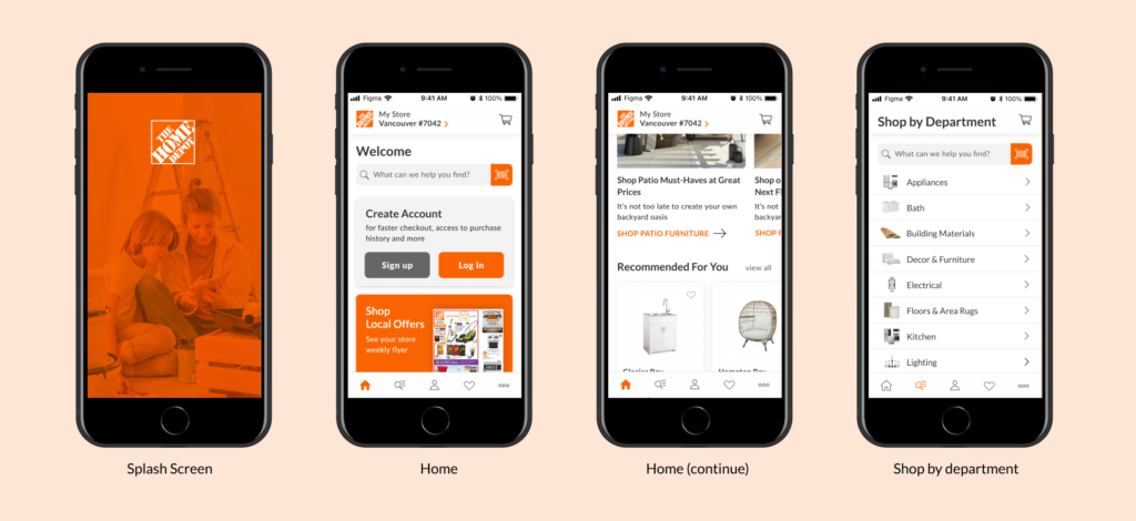
Home
- My store on the top as the product availability depends on the location. When user click, will be redirected to Set My Store page where user can choose the preference store.
- Create Account card that link to Sign up or Log in.
- Shop Local Offers card to see weekly flyer based on the store selected.
- Offers & Info section as carousel.
- More distinction for Scan barcode so that user know that the icon is clickable and remove repetition button for scanning barcode.
- Recommended For You section as carousel with vertical content. Limited rows for product description and the same card height to maintain consistency.
- Same width and height for all images to maintain consistency.
- Subscribe to newsletter card, no need to add button as the whole card is clickable.
- New icon for Home page using a simple icon.
I rearranged the order of the content and select more prominent content to show on homepage. Also removing the repeated button as the whole card itself is clickable.
Shop
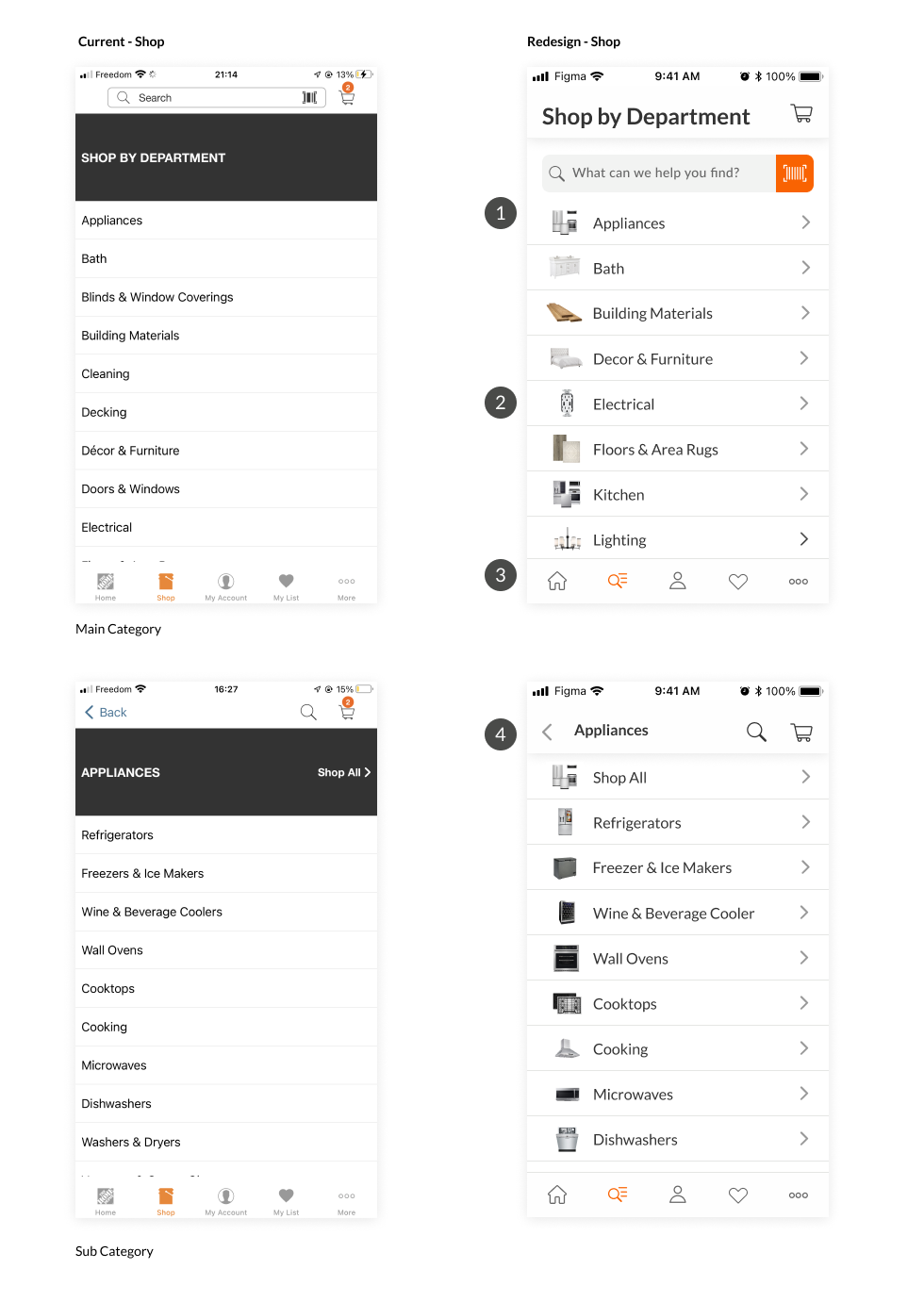
- On the main category page, the search bar located as part of the content. on sub category content user can access search bar as icon on the top.
- Images to describe category and sub category.
- New icon for Shop page using a more understandable icon.
- Title for the selected category

Product Result
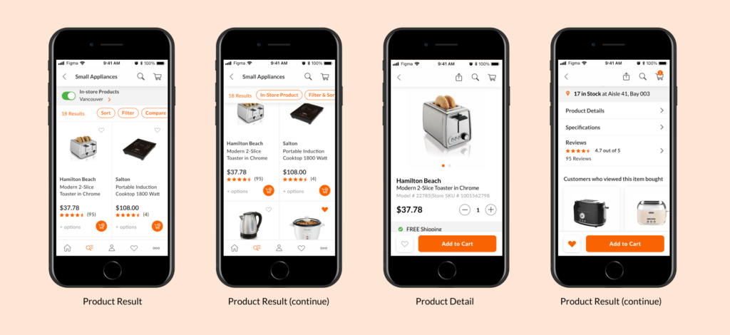
- In store products availability, change the active toggle color to green. When users scroll the page this area will be hidden.
- Area for users to select more options. When users scroll the page this area will be persistent on the top. When users click on Sort or Filter, a drawer will show up from the bottom.
- Vertical content for products. Only display basic info, such as brand, product name/description, price and rating. ‘+options’ means that more information are available. Users can click on the whole card to see more detail about the product.
- Add to cart as an icon to save more space.
Sort and Filter are separated
Product Detail
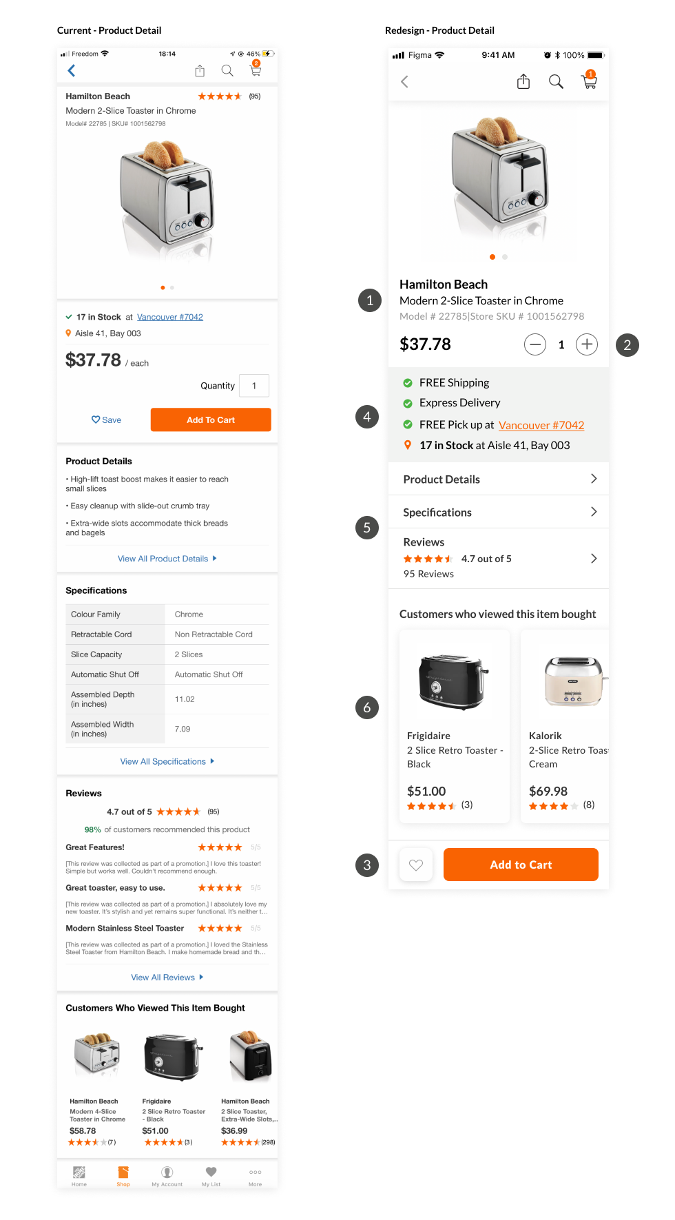
- Product name and description after image to keep consistency with product cards.
- Select quantity by clicking on + or – button rather than typing manually.
- Save to My List and Add to Cart are persistent at the bottom of the screen even when users scroll down the page.
- Delivery and Pickup info. Display what used to be on the product result card.
- Product information. When users click, will be redirected to the correspondent page.
- Recommended product card component.
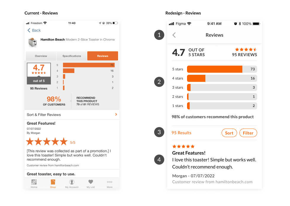
Reviews
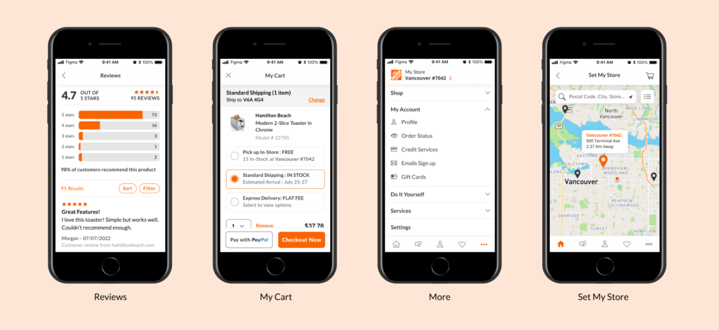
- Title of the page. When user click on back icon, back to product details.
- Total review score. Add text to describe what 1-5 are.
- Total reviews, Sort and Filter option
- User reviews: rating, title, detail review, source
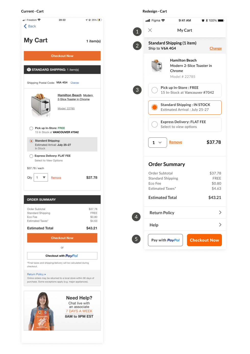
Cart
- Page title stay on the top, same position on all pages.
- How to get that specific item, the title depends on the selected options below.
- Select options to get the item. Each product might have different options.
- Return Policy and Live Chat button, will be redirected to correspondent page.
- Pay with PayPal or continue to Checkout Now, will be persistent at the bottom of the screen all the time, even if user scroll down the page.
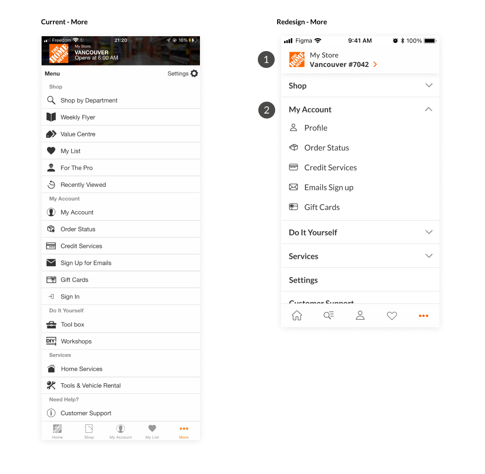
More
- My Store location. When user click, will be redirected to Set My Store page where user can choose the preference store.
- Accordion menu to separate between category. Same style for icon with outline.
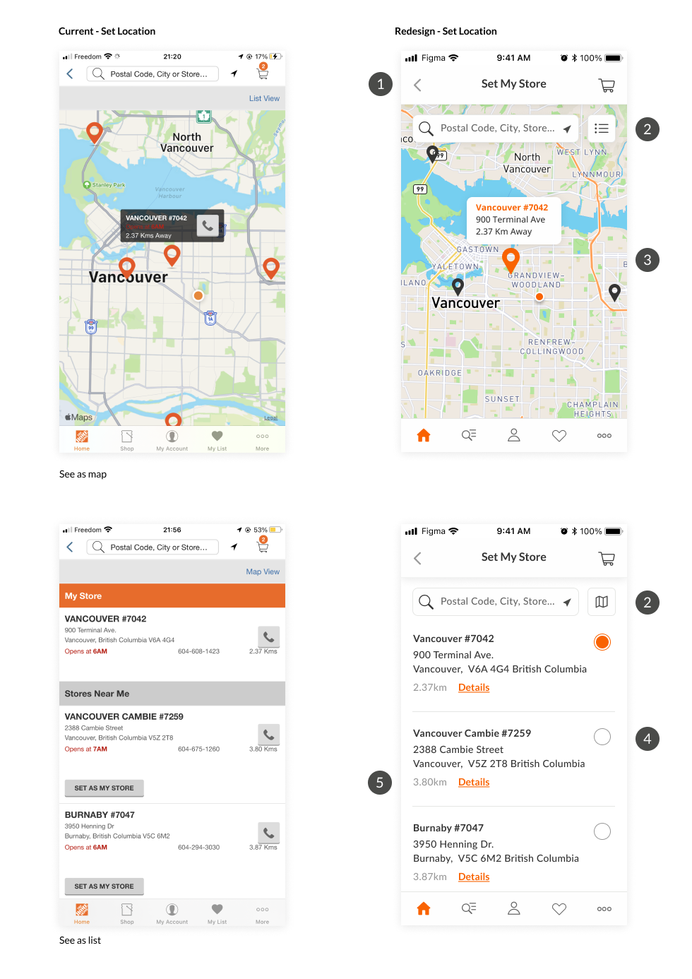
Set Location
- Title of the page so user know what page are they looking at.
- See the list of location as List or Map.
- Different color and size of the pin point of the selected location.
- Radio button to show which one is active. The chosen store (my store) will stay on the top.
- Only show important info to the user. When user click on Details, they can see mored detailed store info.
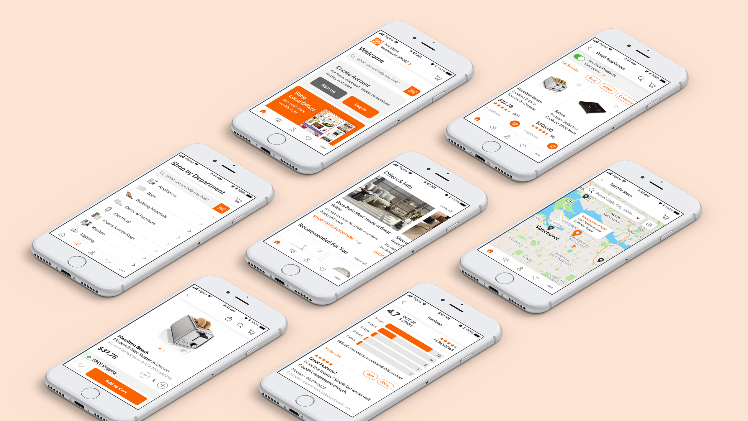
Mockup
