Overview
edX started as a website learning platform before they launched a mobile app that allows students to learn that fits into busy schedules. Stream or download videos to watch at your convenience. Catch up on the week’s lessons during your commute, or save videos to watch offline when there’s no Internet access. This case study focused on the app’s UI and UX to improve the user experience.
List item 1
List item 2
List item 3
Role
UX/ UI Designer
Skills
User Flow, Wireframing, UI Design, Prototyping
Tools
Figma
Problems and Solutions
Based on the reviews and after I tried using the apps, I found several problems and I tried to come up with solutions :
Navigation Menu
There are two different navigation menus on the apps. The main navigation menu is different with the navigation menu for the Course page. Therefore, I only using one bottom navigation in all screens
Layout
Because the content of the apps is based on the website, the layout seems cluttered, and it’s clearly seen that it’s not built for mobile apps. The apps don’t maximize the space and much waste space. To tackle this, I maximize the spacing by reducing the size of the title font and selecting important content to be displayed. All screens have the same layout to make every screen continuous.
Course
Users are unable to unenroll from the course and they can’t see the progression they have made or where they left of. All content is laid all together without separation which causes confusion. In offline mode, users can only download videos and can’t access complete modules.
For the enrolled course I changed several things, such as :
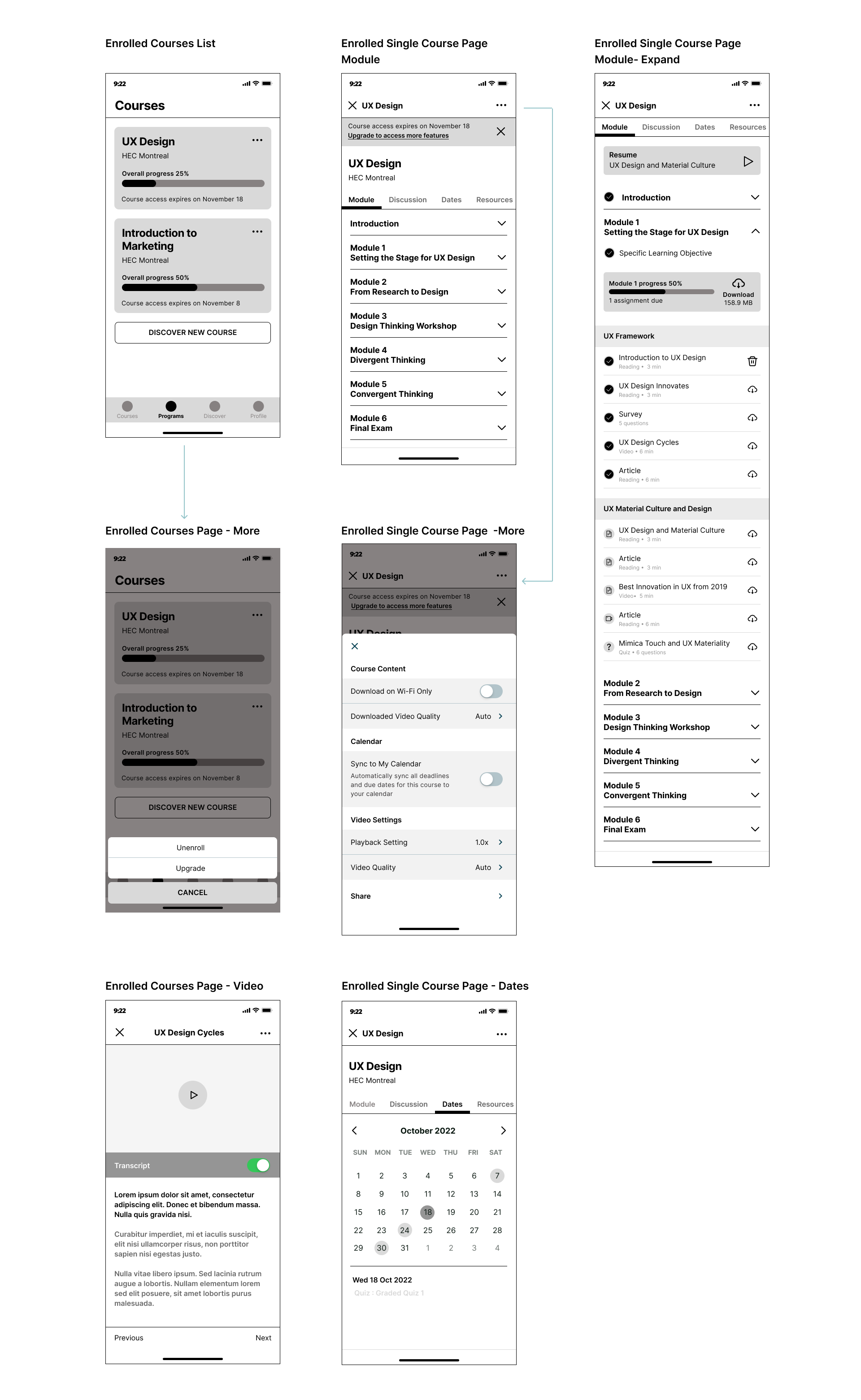
• Additional function to unenroll from a course and button to upgrade the course.
• Add a progression bar, so users know their progress
• Bottom navigation that used to be on the enrolled Course changed to tabs.
• Combine the content for videos with the modules tab since the video is duplicated and allowing users to download the whole module content
• Separate each module with an accordion menu. When users press on a module, it will collapse and reveal the content of the particular module
Search & Filter
The filter lacks a few things such as the course length and course type, users need to scroll and click repeatedly looking for specifics in those categories. To solve this problem, I add more filter option on Filter and keep the search bar and filter on the top pf every Discovery screen
Video
There are no video settings for playback speed, video quality, or turning off the transcript. I add additional settings for video playback speed, quality and transcript.
Current User Flow
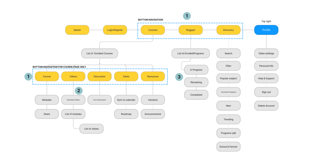
Notes:
1. There are different bottom navigation between the main navigation and navigation only on the Enrolled Courses page.
2. User can only download video and no video settings.
3. On the enrolled programs page, all content is in one page, with no separation
Redesign User Flow
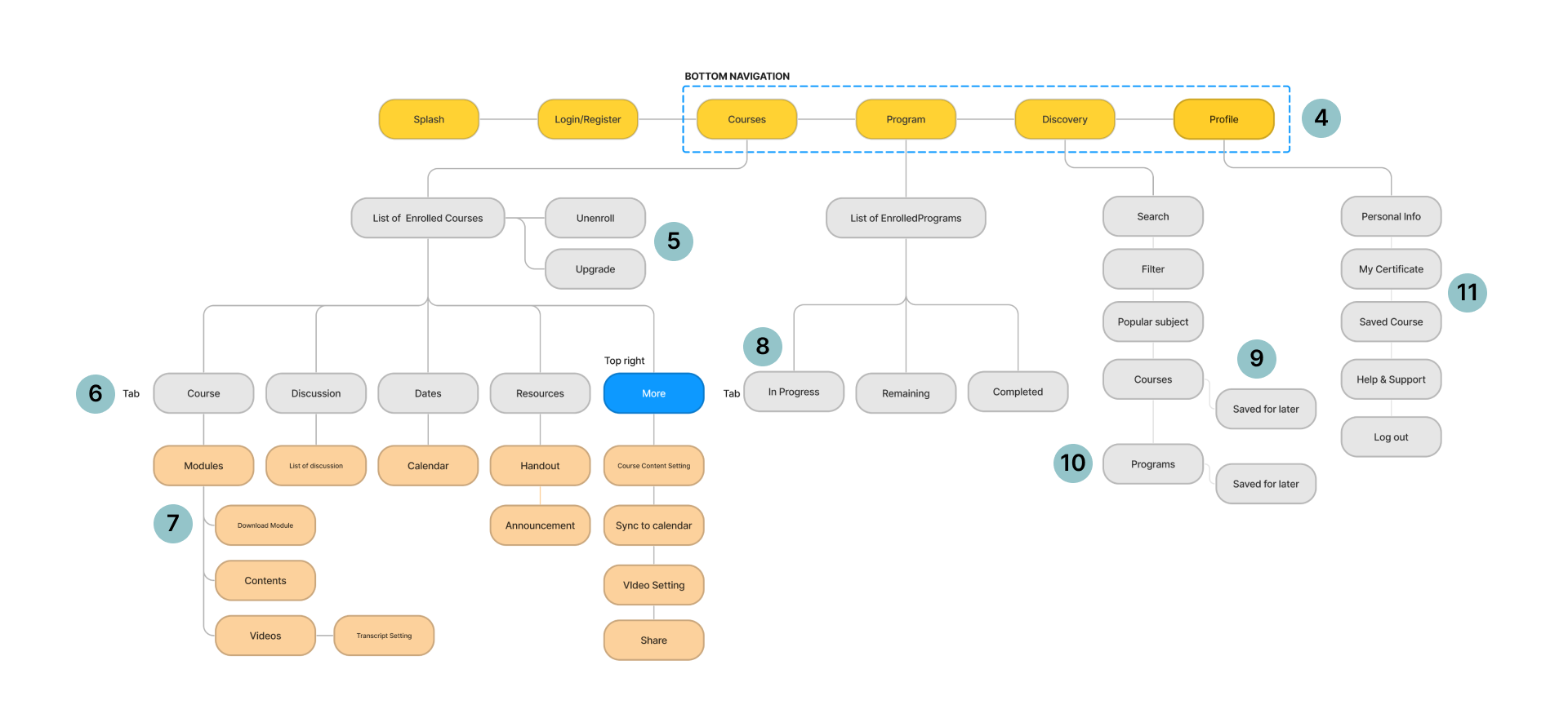
Notes:
4. Bottom navigation menu: Courses, Programs, Discovery, Profile. Stay the same in all pages.
5. Options to unenroll and upgrade a course
6. Tab for enrolled courses: course, discussion, dates, resources. Add more button on the top right for quick settings
7. Combine videos with modules, allowing users to download all contents
8. Categorize the content as a tab for enrolled programs : In Progress, Remaining, Completed.
9. Allowing users to bookmark courses and programs and save it for later
10. Divide the programs into 7 categories and list the programs based on the program categories.
11. My certificate and Saved Courses for accessing their certificate and courses they’re interested in.
Redesign Wireframes
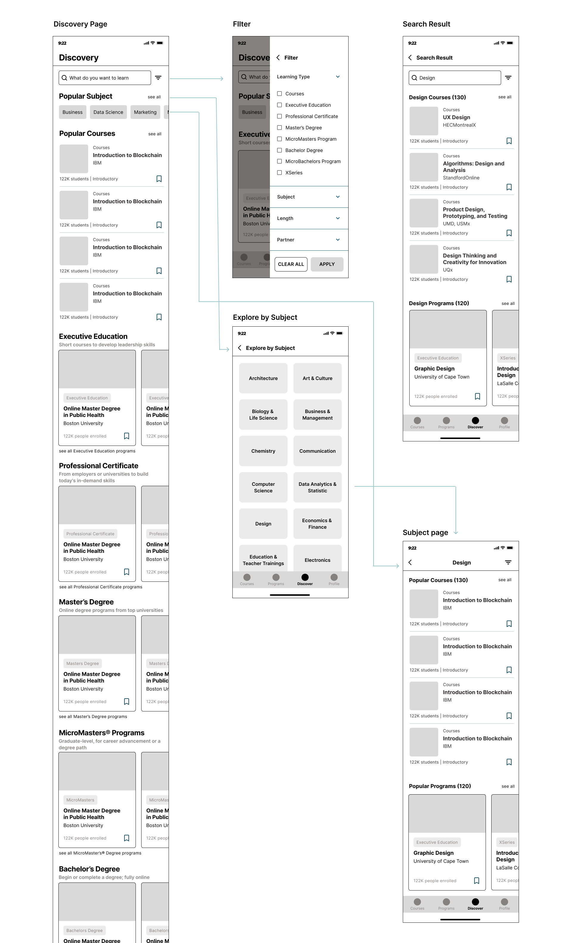
Discovery Page
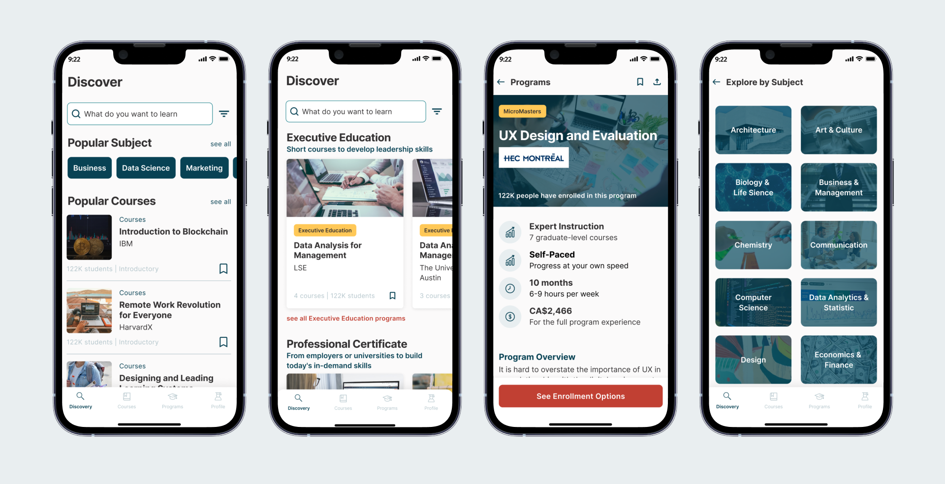
To save some space, I reorganize the content by selecting important content to show and add a filter beside the search bar to help users find courses easily. I create different cards for Courses and Programs to clearly differentiate them. I add a new function for bookmarking the Course or Program to their Saves Course if they like to access it later. To keep everything organized, I display the Programs based on their category; Executive Education, Professional Certificate, Masters Degree, MicroMaster, Bachelor, MicroBachelors, and XSeries. When users scroll down, the search bar and filter stay on the top, so users don’t need to scroll back up if they want to search for something.
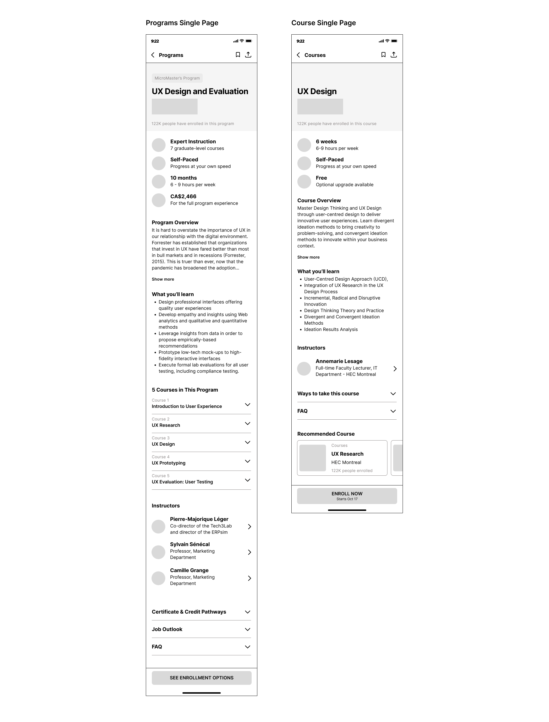
Programs & Courses Single Page
I maximize the available space by using a smaller header size and title font size. To maintain the consistency between Programs and Courses, the same order of the content is applied; a glance at the Program/ Course, Program/ Course overview, What you’ll learn, Instructors, Ways to take the course, FAQ, and Recommended course. The button for bookmarking and sharing the Program/ Course is on the top right and the CTA button to enroll will be floating at the bottom of the screen.
Enrolled Course Page
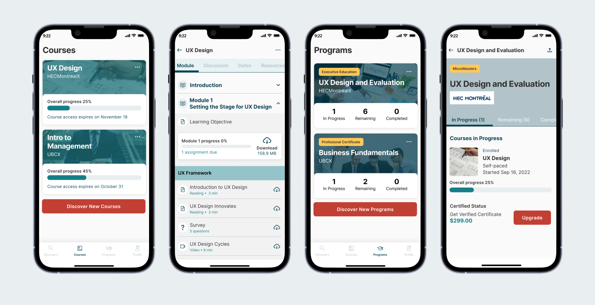
I add a progression bar so that users know their progress so far, and an option to unenroll and upgrade the course. On the enrolled course page, I removed the secondary navigation menu at the bottom and changed it to tabs. The tab menus are module, discussion, dates, and resources. On the Module tab, I applied a collapsible menu for the content so that all the content will be listed on the same screen rather than opening a new screen. Each content is represented by icons; such as reading, quiz, videos and give information on how long it will take to finish. Users can download each content or download all content per module.
Another things are I added a switch button to toggle on/ off transcript on video page and I changed the format of important dates as calendar.
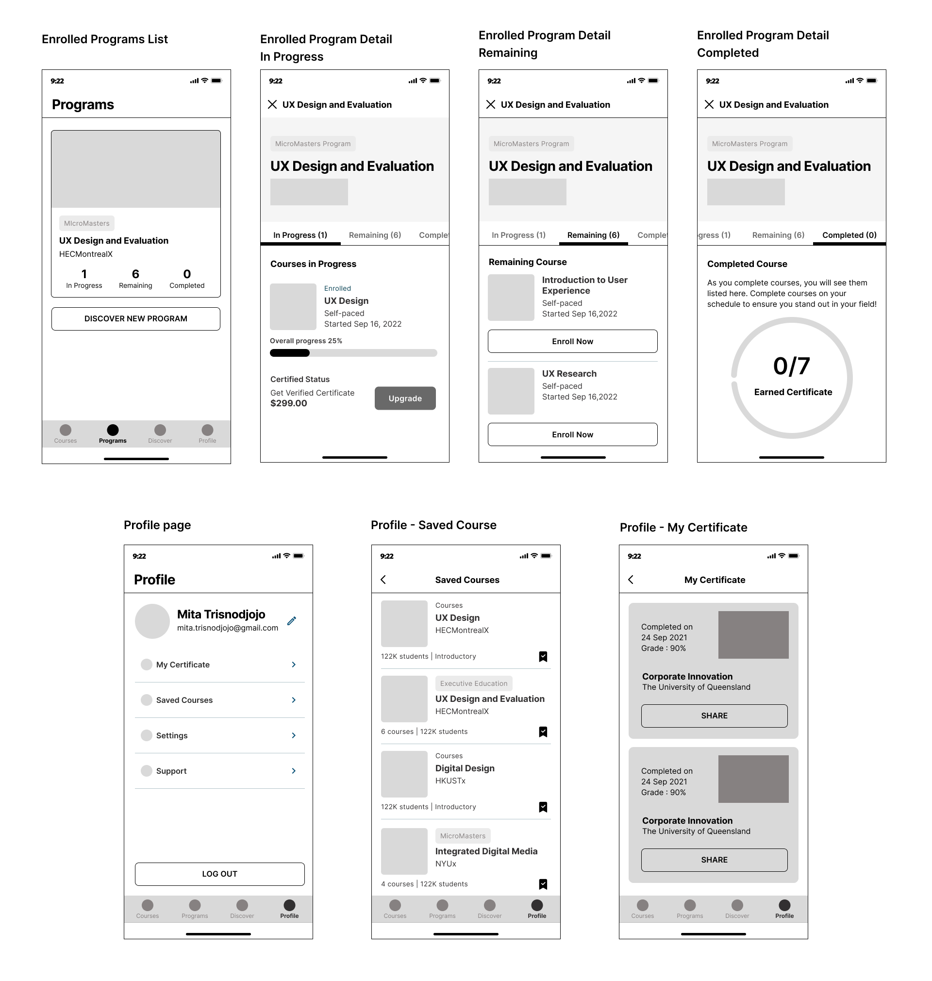
Enrolled Programs
I created a tab menu for the program status : In Progress, Remaining, Completed. I also add progression bar and upgrade button for the course in progress. User can view the course when they press the course title.
Profile
Profile page become the part of the bottom navigation. On the profile page, users can edit their personal information, access certificate, saved course, and settings. I also created additional screen for Saved Course and Certificate of Completion. If users interested in a particular course or program and want to save them for later, they can bookmark them. Users can swipe left to remove. As for My Certificate, users can access their completed certificate and share them.
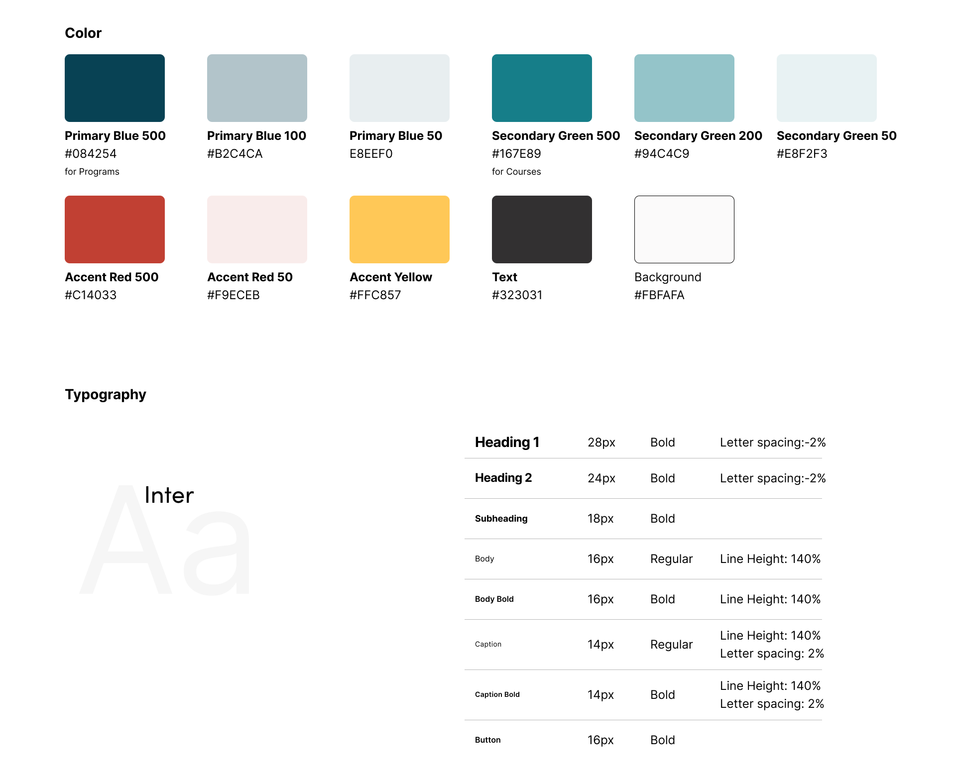
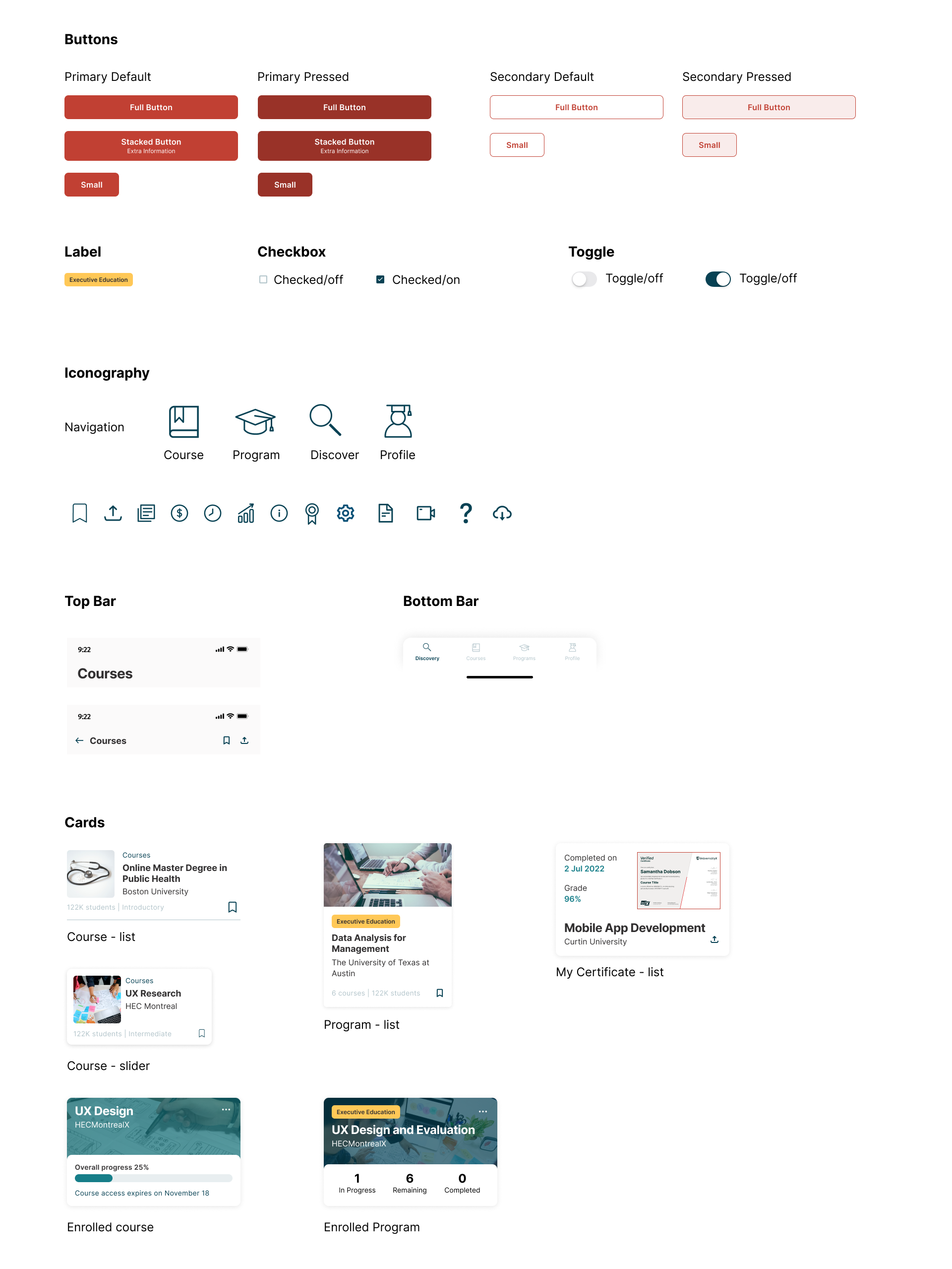
New UI Kit
Current vs Redesign
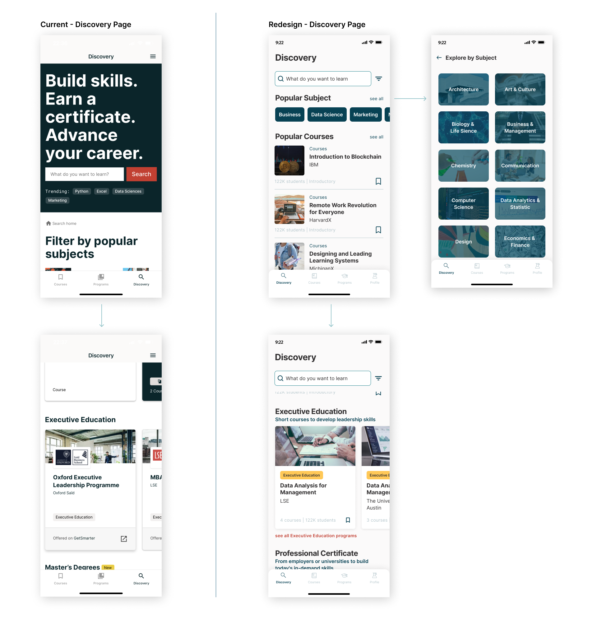
The layout of the Discovery page of the current version basically mirroring the web version, it waste so much space. The redesign version maximize the space as efficient as possible. When users scroll down, the search and filter will stay on the top. Users can also Explore by Subject in a separate page.
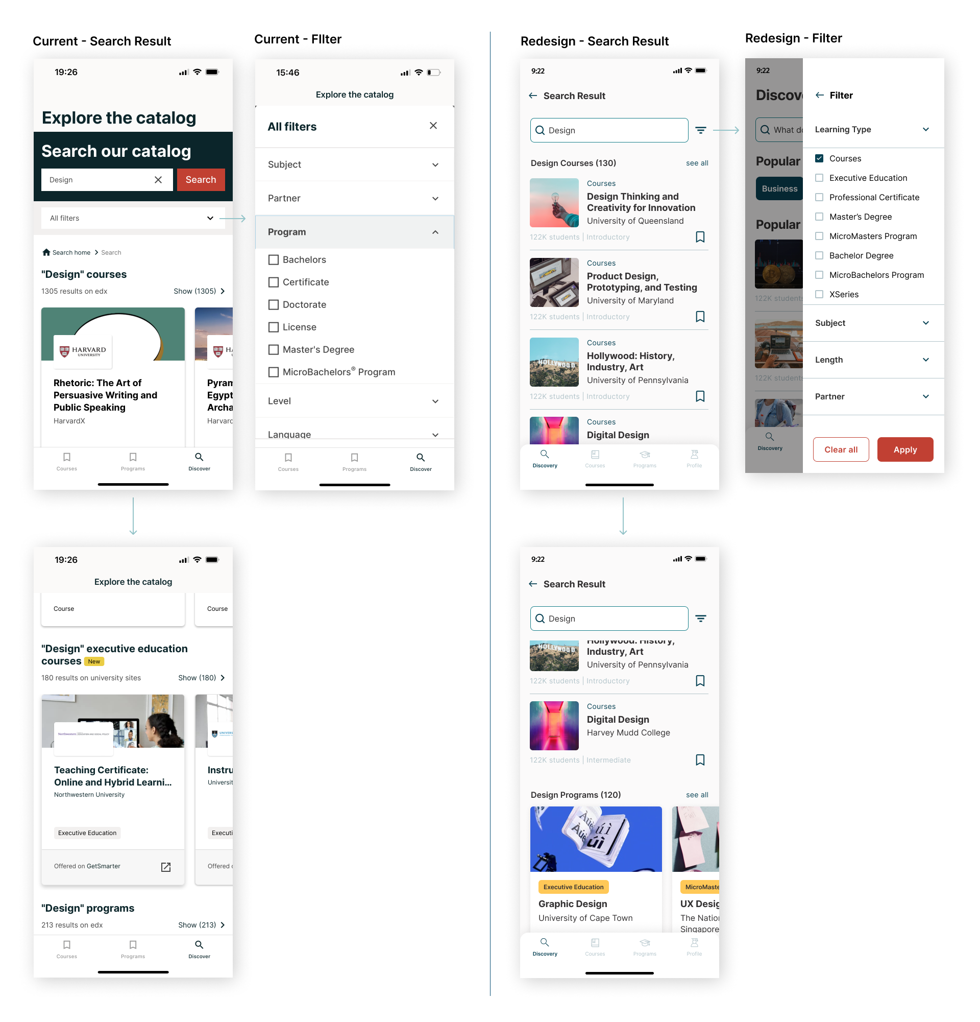
For search result, it will be differentiate between Course and Programs and users can ‘see all’ courses and programs.
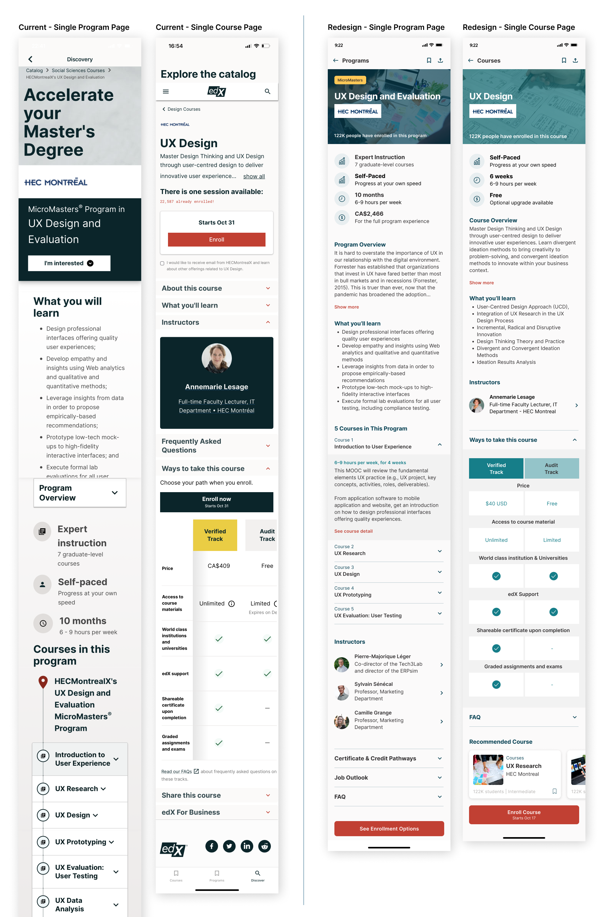
The redesign version between Course and Program single page looks consistent based on the content order and they’re differentiate by using different color to represent each of them. The users also can check on recommended course that are under the same Program.
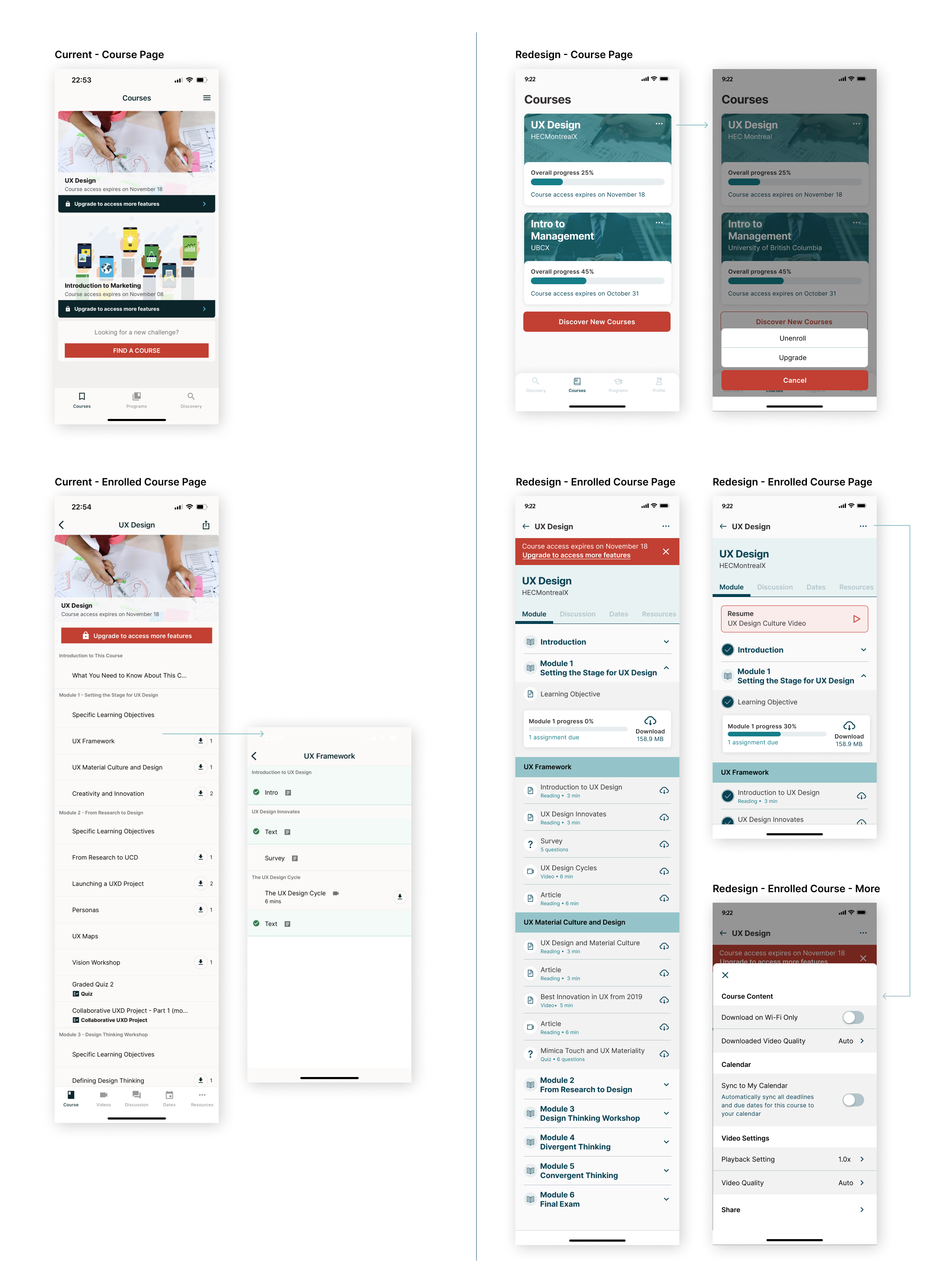
On the redesign version, the second bottom navigation bar are removed and change the navigation as a tab menu. It also important to give clear separation between each module and the progression of the module. Users can download all materials or select any of them.
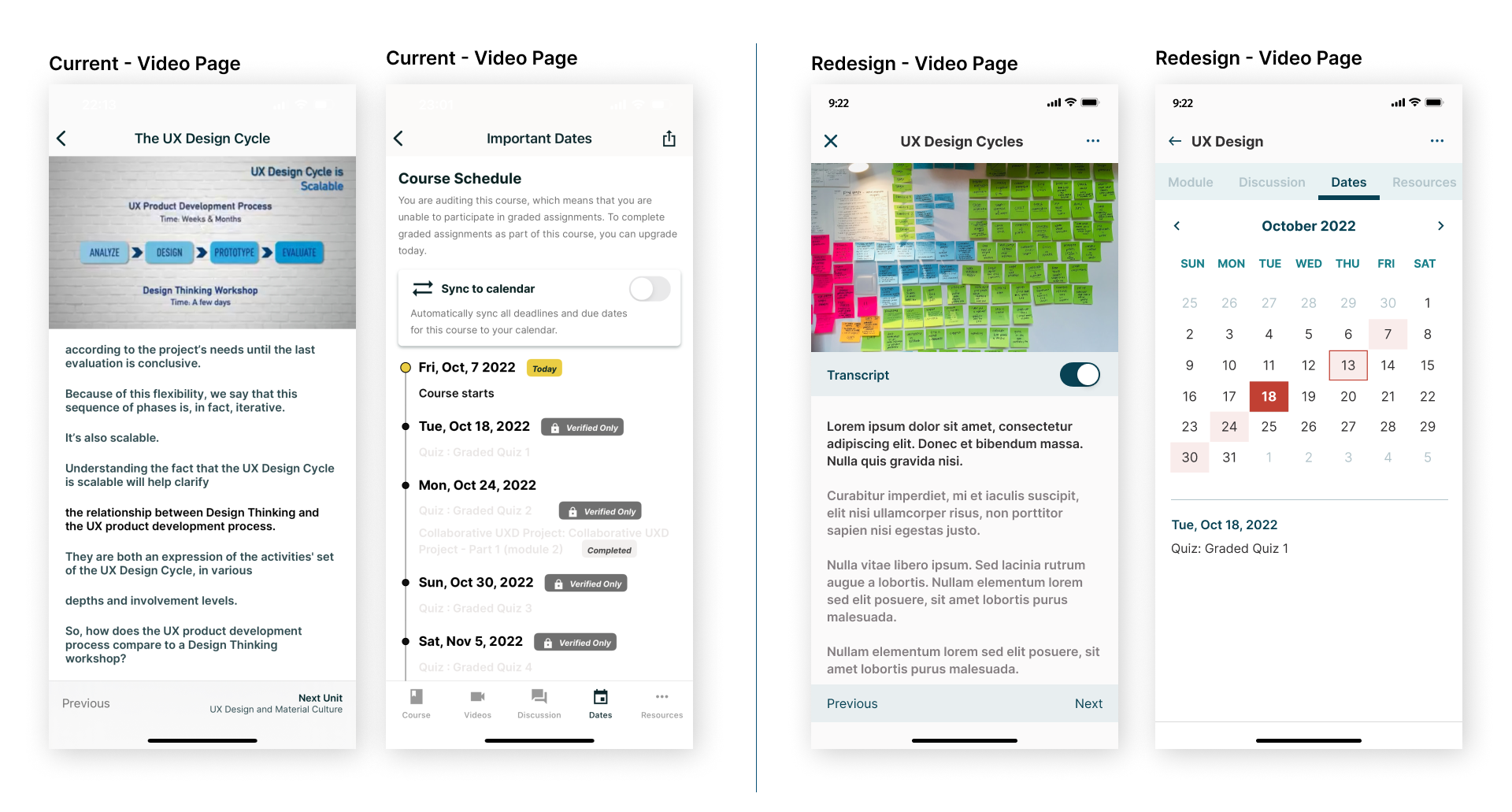
Important dates format is changed to calendar view as it is easier to track, there are three states to represent today’s date (pink square with red stroke), selected date (red square), and available events (pink square). On current version, there are no option settings for video. Here in the redesign version, users can access the settings on top right, including the option to sync to calendar.
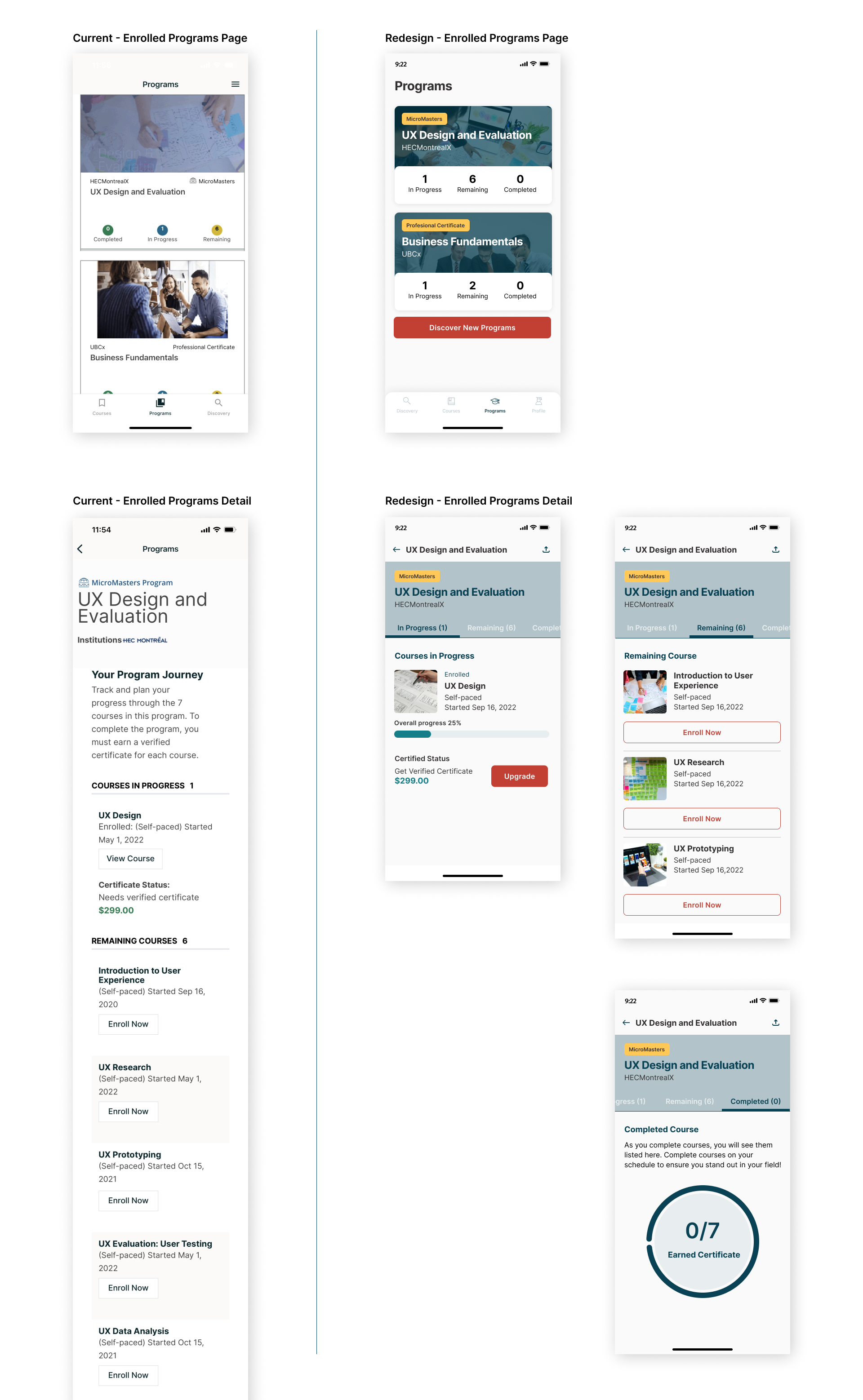
Rather than showing all information in the same screen, tab menu was used for Program status; In Progress, Remaining, and Completed. As In Progress, users are informed their progress by the progression bar.
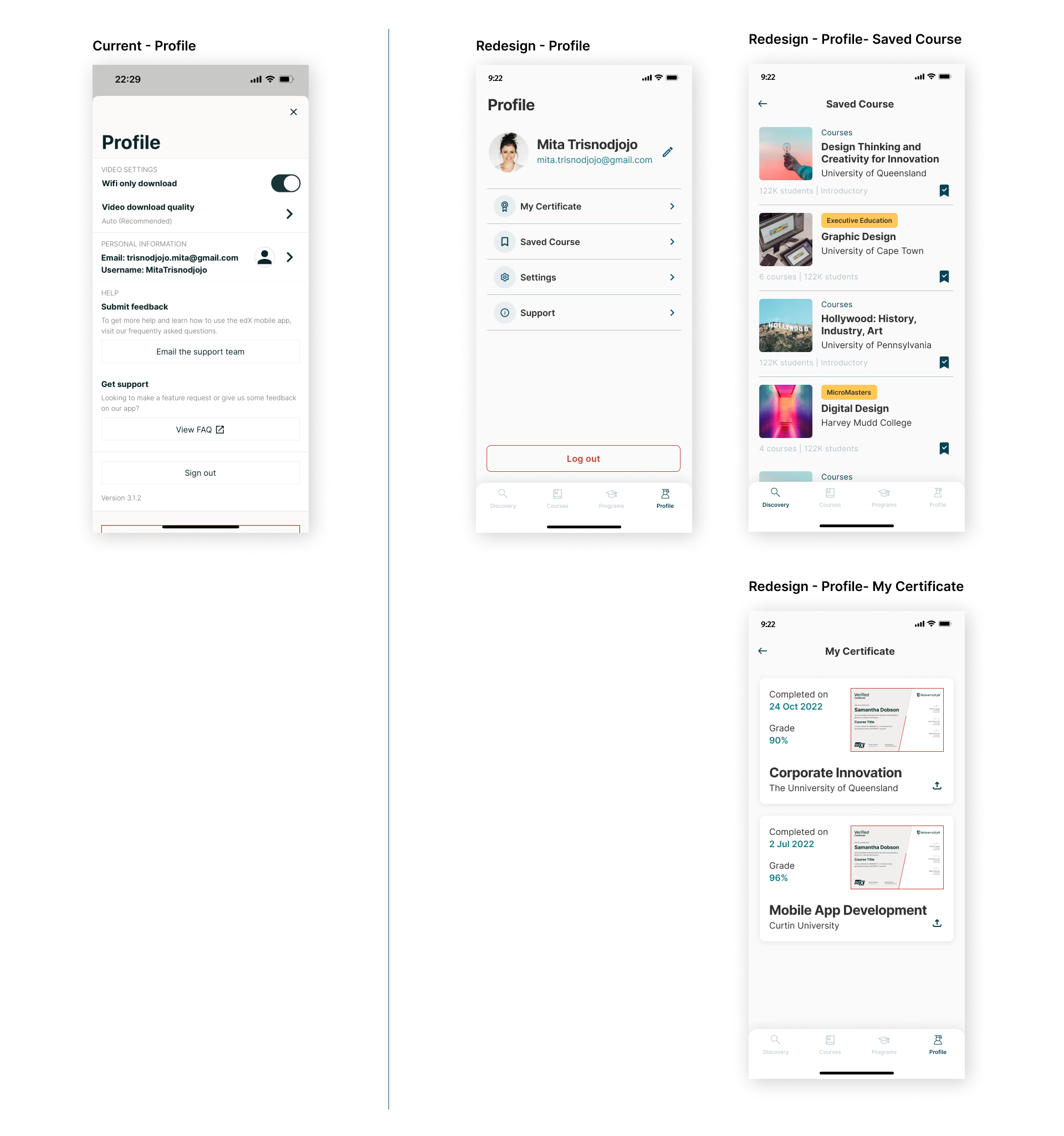
On the redesign version, Profile is part of the bottom navigation bar. Users can access their completed certificate and share them. All courses and programs that users saved to bookmark can be accessed on Saved Course page.
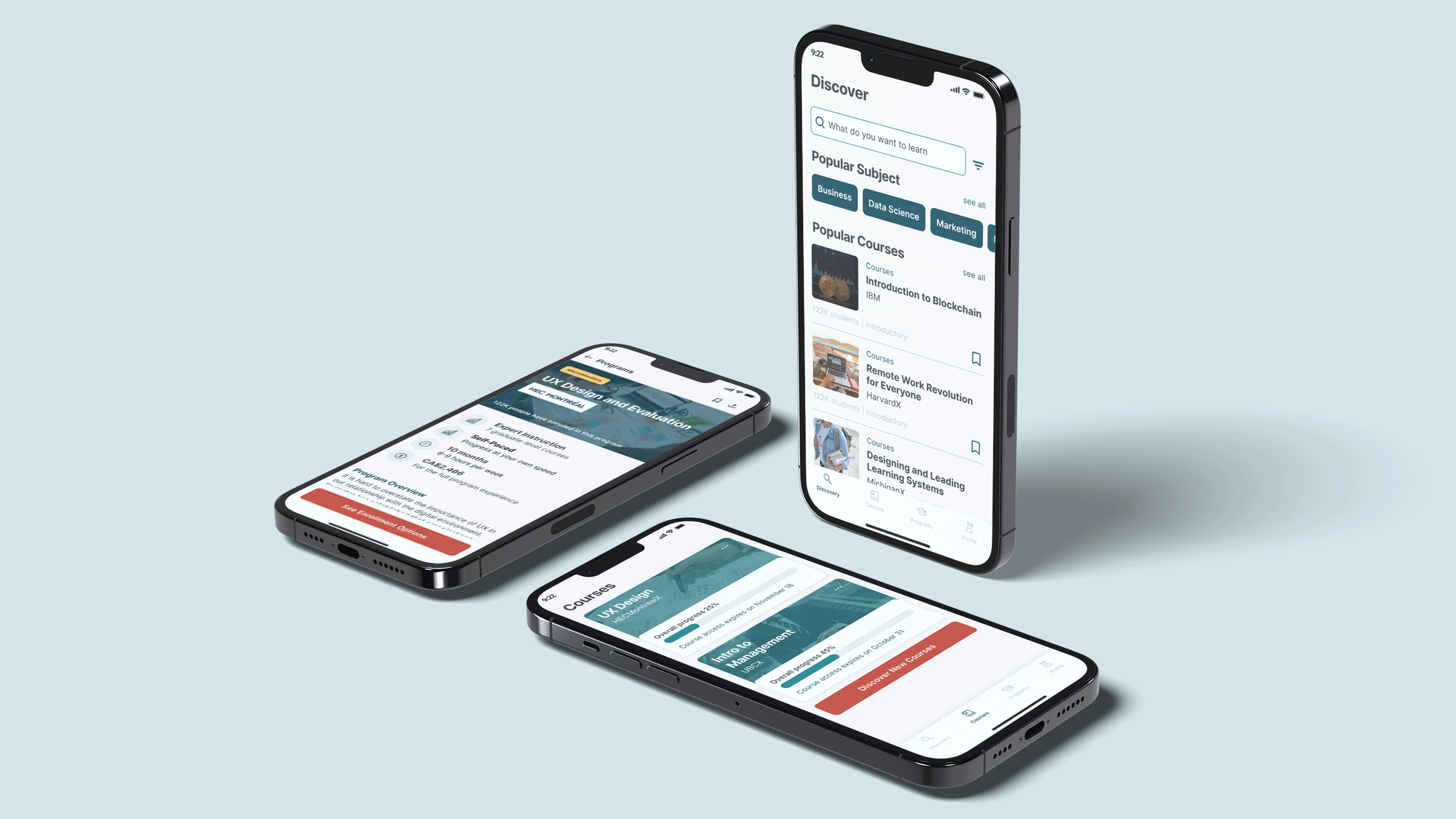
Mockup
