Overview
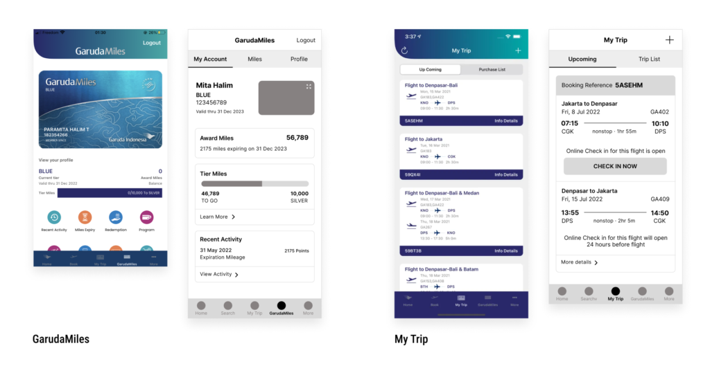
A case study on Garuda Indonesia Airline mobile app, Fly Garuda (Version 5.2.10 (250)) based on UX stand point. I chose this app because I’ve been using this app to explore flights and manage my flight booking, but I always find this app confusing and not compelling compared to other flight apps. The case study constraints are no additional features added, removing content and structure, but it is allowed to move the content to another screen. This case study is limited only to UX design and I used Figma as a design tool.
Role
UX Designer
Skills
User Flow, Wireframes
Tools
Figma
Problem and Solution
Based on UX, I found some issues through the app:
- A confusing home screen with too many submenus to choose from makes this app not focus on its primary function.
- Lack of label on Search Flights & Calendar and page title which causes confusion on which selection or page users are looking at.
- Lack of info on the Select Fare page; what is the benefit of each fare.
- The position of the filter and sort are hidden at the bottom.
- The booking summary and flow are confusing as the app laid everything on one page and the user could easily miss some steps.
- Too many steps must be taken to select seats and additional baggage on the Add-ons page. The default state of the button is grey and easily mistaken as inactive.
- Too wide submenu without proper categorization.
Because we’re not allowed to delete any content or add features, I’m focussing the solution on the booking flow and the categorization of the menu. The goal is to give more straightforward information on which page users are looking at and to create a simpler experience for users when they access the app and book a ticket.
Current User Flow
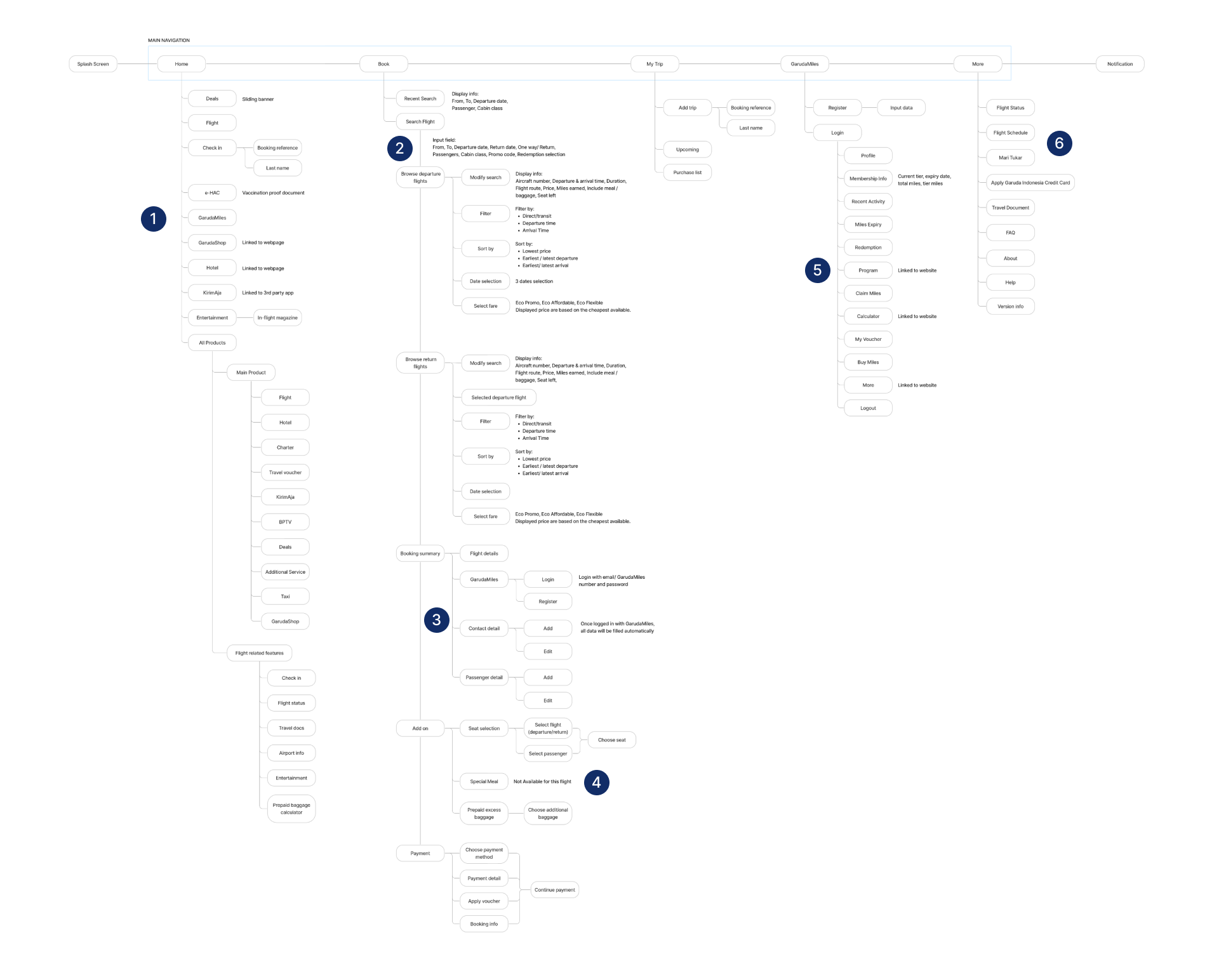
Notes:
- All submenu laid on home and more menu on All Product
- Not too distinctive switch button between one way and return trip
- Flight details, login, contact detail, and passenger details are on the same page, users need to click on the submenu and input field. Users could easily miss this step.
- Modal box to select a seat and additional baggage for which flight and which passenger. Unavailable add-ons are also listed.
- All submenus about membership and miles laid altogether
- The rest of the submenu listed on More
New User Flow
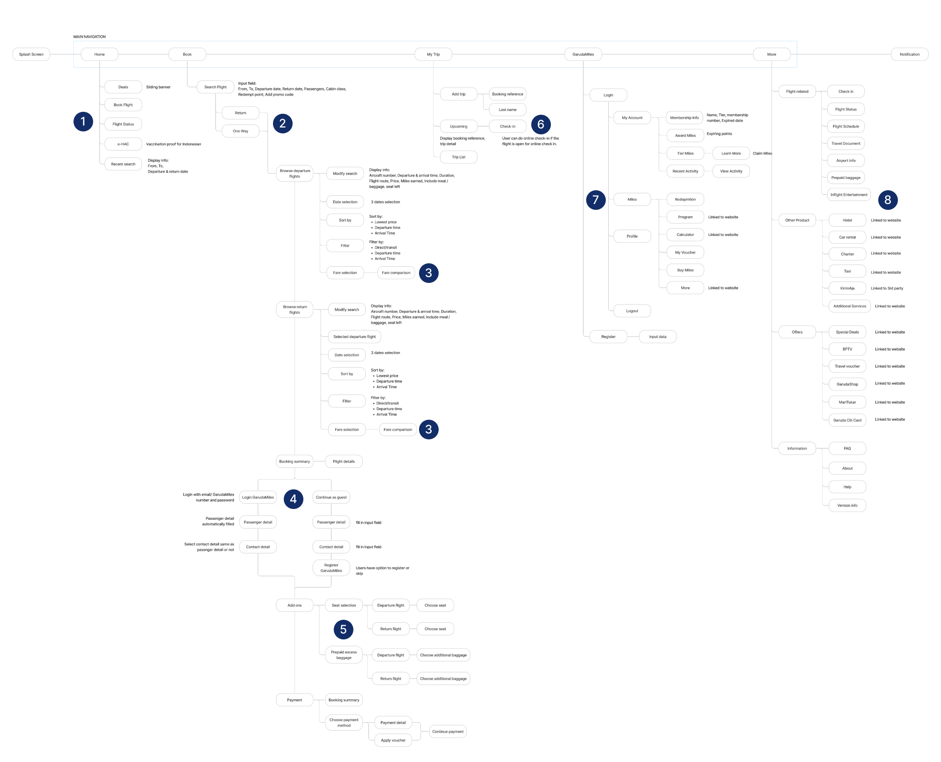
Notes:
- Highlight the important submenu on home
- Tab menu for return and one way flight.
- Select fare with each fare benefits information.
- After user choose the flights, will be directed to login or continue as guest. As a guest, user can register before continue to payment.
- For Seat Selection and Prepaid Excess Baggage, user will be directed from departure flight then return flight.
- Add trip by inserting booking reference and last name, same step as check in. User can check in the available flight on this page
- Tab menu for GarudaMiles page, differentiate by My Account, Miles, and Profile
- Categorize submenu on More page
Current vs New Mobile App
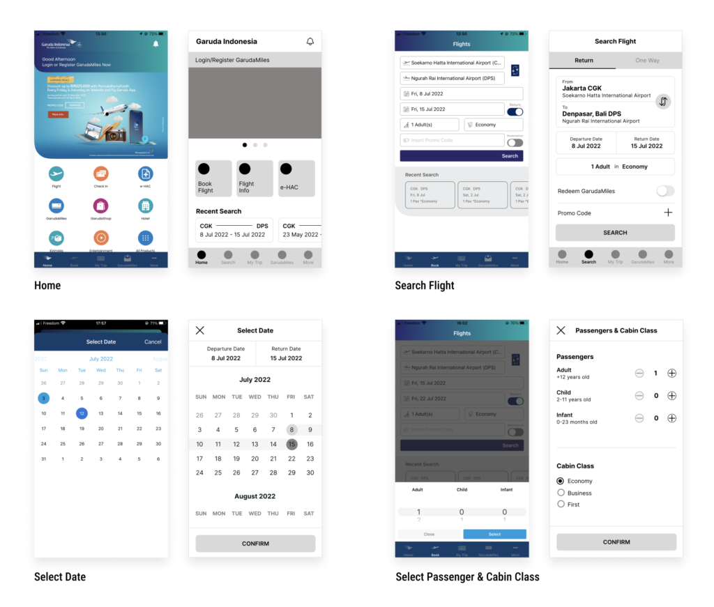
Home – I highlighted important content on the homepage and moved the rest to More page. Also, move the recent search to home as this will be the first page user see when they open the apps.
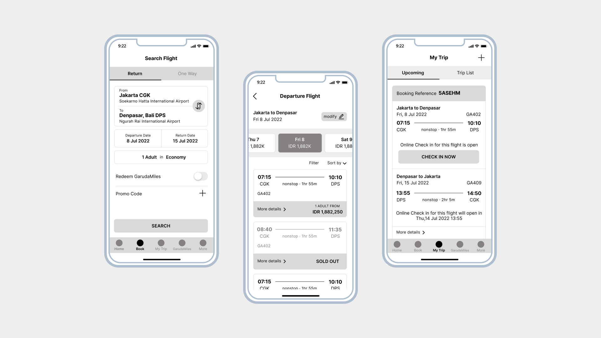
Search Flight process – I used a tab to separate one-way and return flights and a more intuitive input field and selection process.
Departure and Return Flight Selection – Bigger font size, move sort and filter to the top, clearer hierarchy in displaying content such as in the flight information.
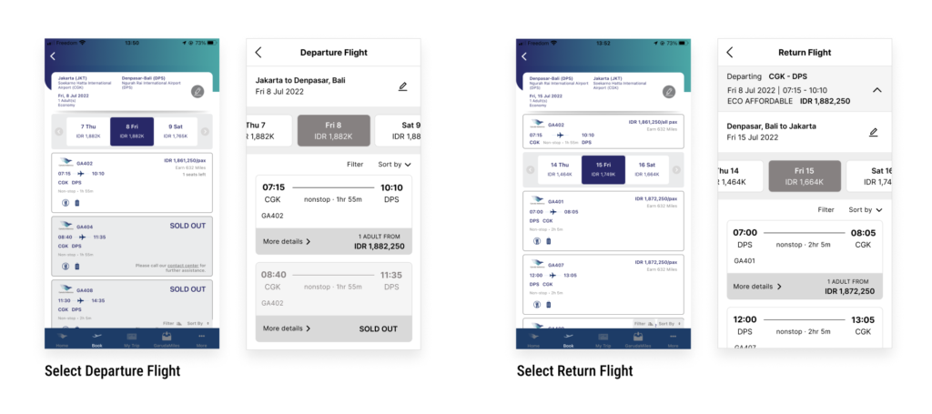
The flow for select fare will be: Select Departure Flight – Select Fare then Select Return Flight – Select Fare. Users can see each fare’s benefit before deciding to select it. The selected fare will be highlighted and they can continue to the next step.

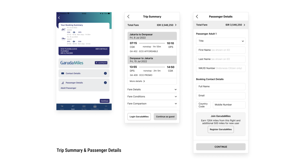
Trip Summary & Details – I separate the page for the trip summary and passenger details. During the booking process, I always accidentally skip logging into my GarudaMiles account and entering my contact details.
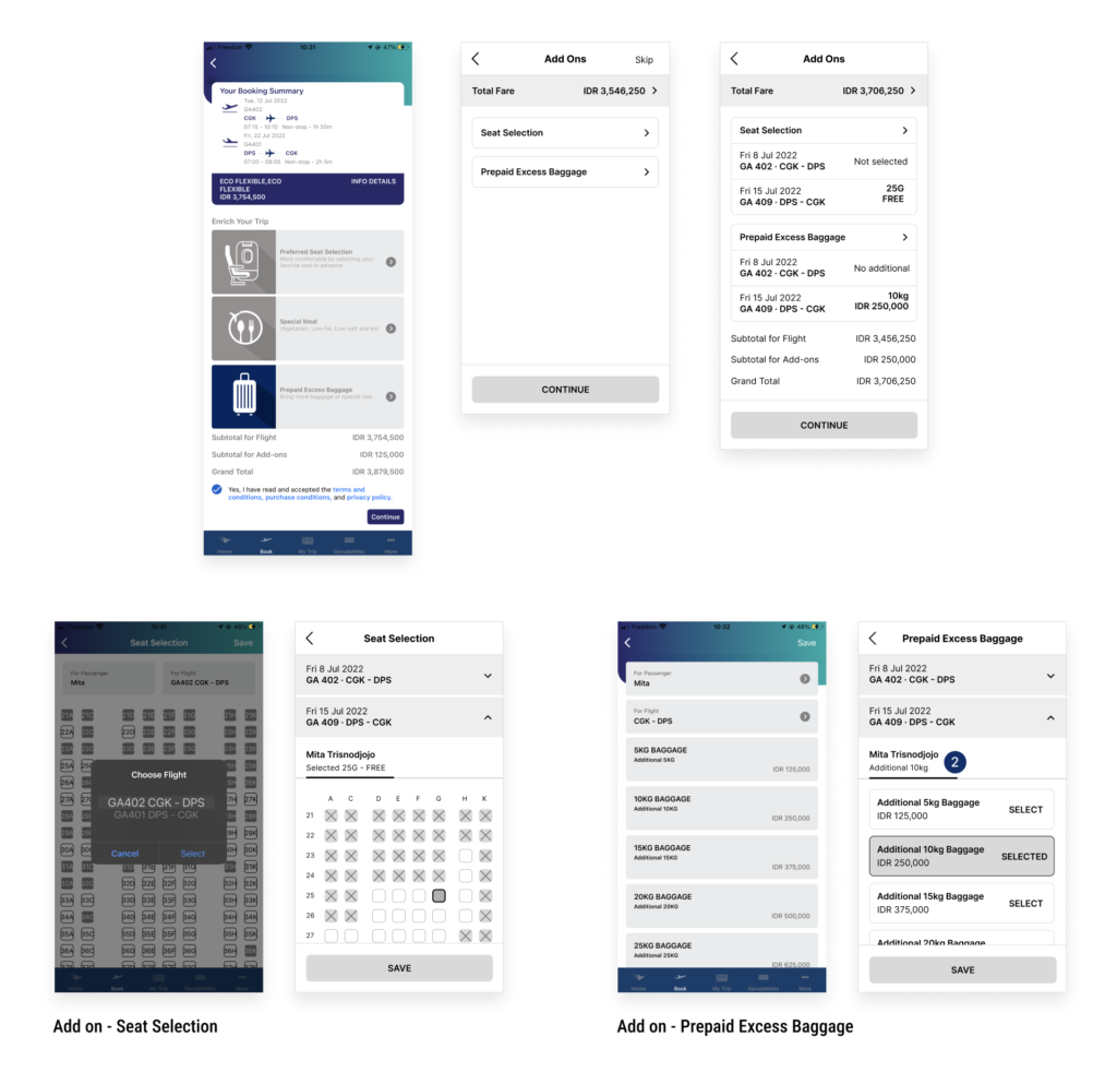
Add-ons – Only displaying add on that’s available for the flight and directed the user to choose departure the return flight. After user chose the add ons, display them so user can confirm what they’ve selected.
GarudaMiles page – I categorize the information using tabs so that it won’t be too overwhelming for the user.
My Trip – User can manage their booking inluding access online checking on this page.
