Overview
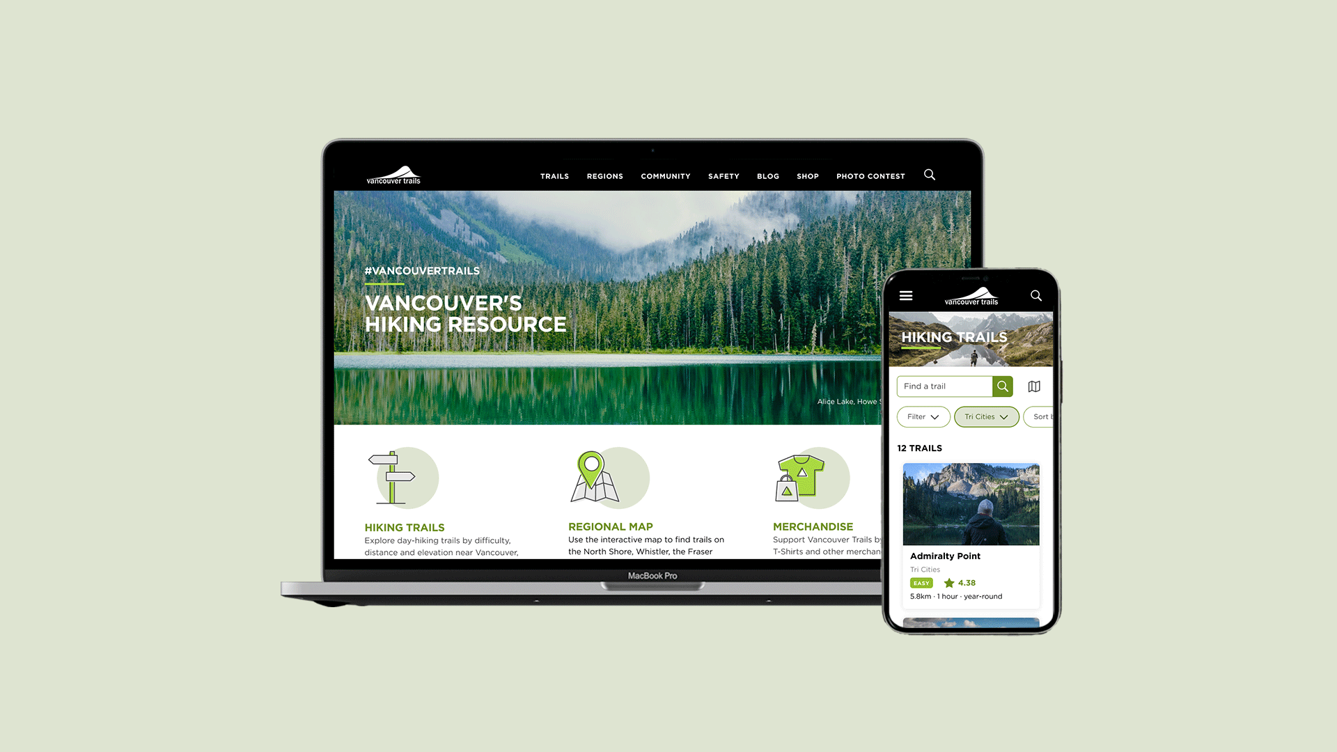
www.vancouvertrails.com is a website that provides information on trails in Vancouver and its surrounding that helps local hikers and tourists of all fitness levels get information on which trail could be completed as a day trip from Vancouver.
This case study will focus on the UI side to improve the website’s overall look with an efficient layout.
Role
UI Designer
Skills
UI Design, Prototyping
Tools
Figma
Problem Analysis
Vancouver Trails website should provide clear information for users but how the information is displayed is ineffective and cluttered.
• Inefficient space of the menu, banner image and newsletter sign up.
• Filter and sort tables to display information don’t behave as they should.
• Ads are everywhere and at random places.
• Too much information (text), users needs to scroll a lot.
My Solution
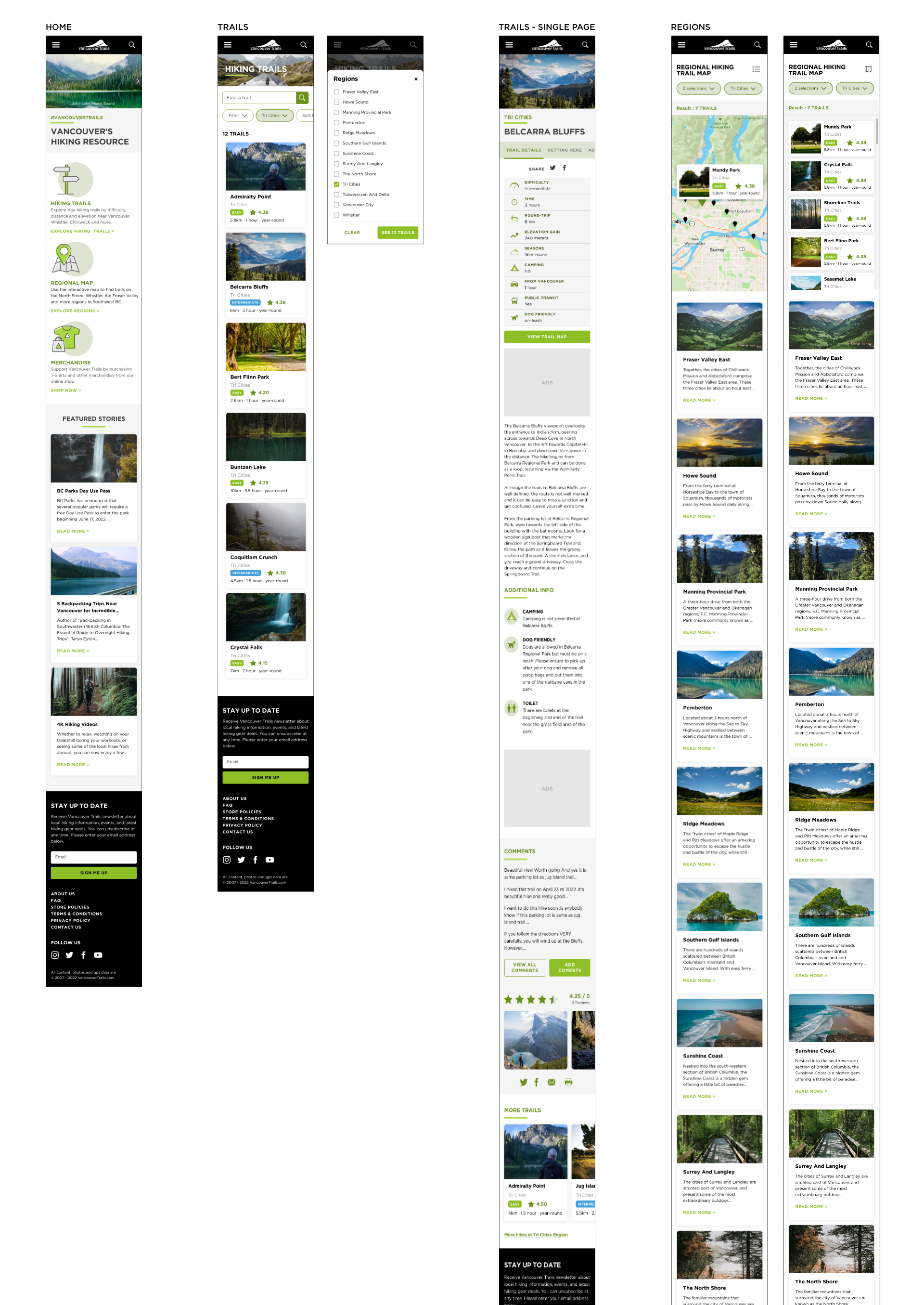
• I use cards with image instead of table to make it easier for users to choose, as images are more effective than text.
• Tab menu on the Trails single page, so that users will be directed to the correspondence content instead of scrolling a lot.
• Fix the filter option on desktop and mobile on the Region page so that users can see results by list or map.
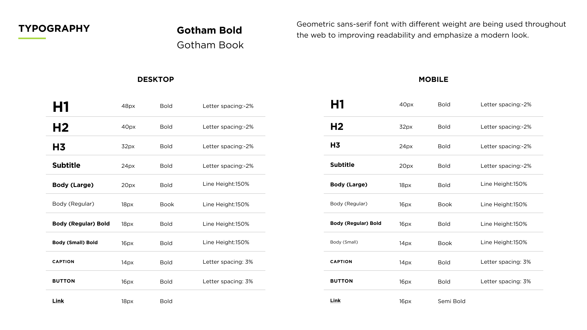
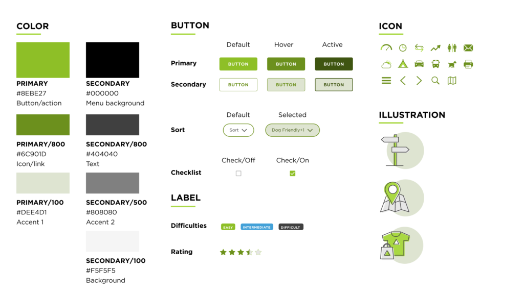
New UI Kit

Current VS Redesign Website
Homepage
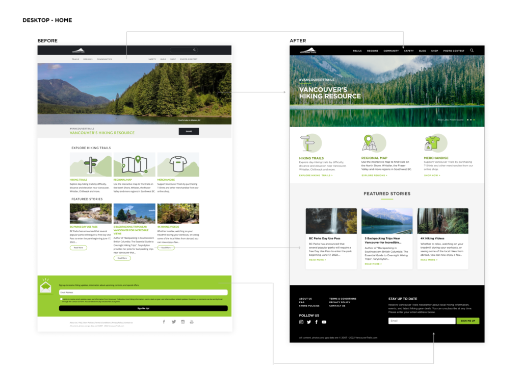
I combined all page menu in one line to save more space on navigation menu then separate the section between the highlights navigation and Featured Stories to help users easily navigate the website . To create consistency throughout the website, I created card for Featured Stories and limit the numbers of line. The current website has an inefficient footer as the email input field take the whole screen, I changed it to two columns layout to maximize the space.
Trails
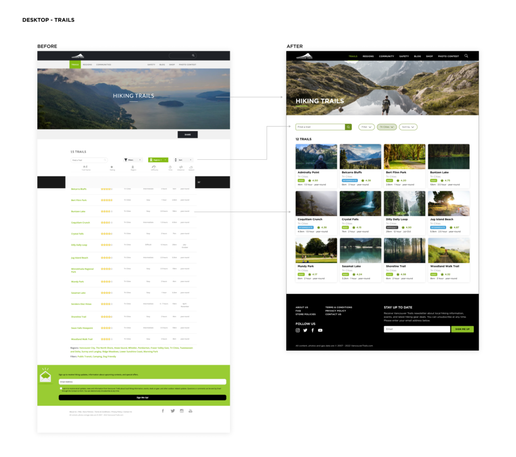
The main change I made is the list of the trails, from table to cards. All information is kept with the addition of images to make it easier to make decision-based on images. A more detailed rating system with scores and differentiated difficulty levels with different color labels. The filter and sort selection input also changed into a more modern layout.
Trails Single Page
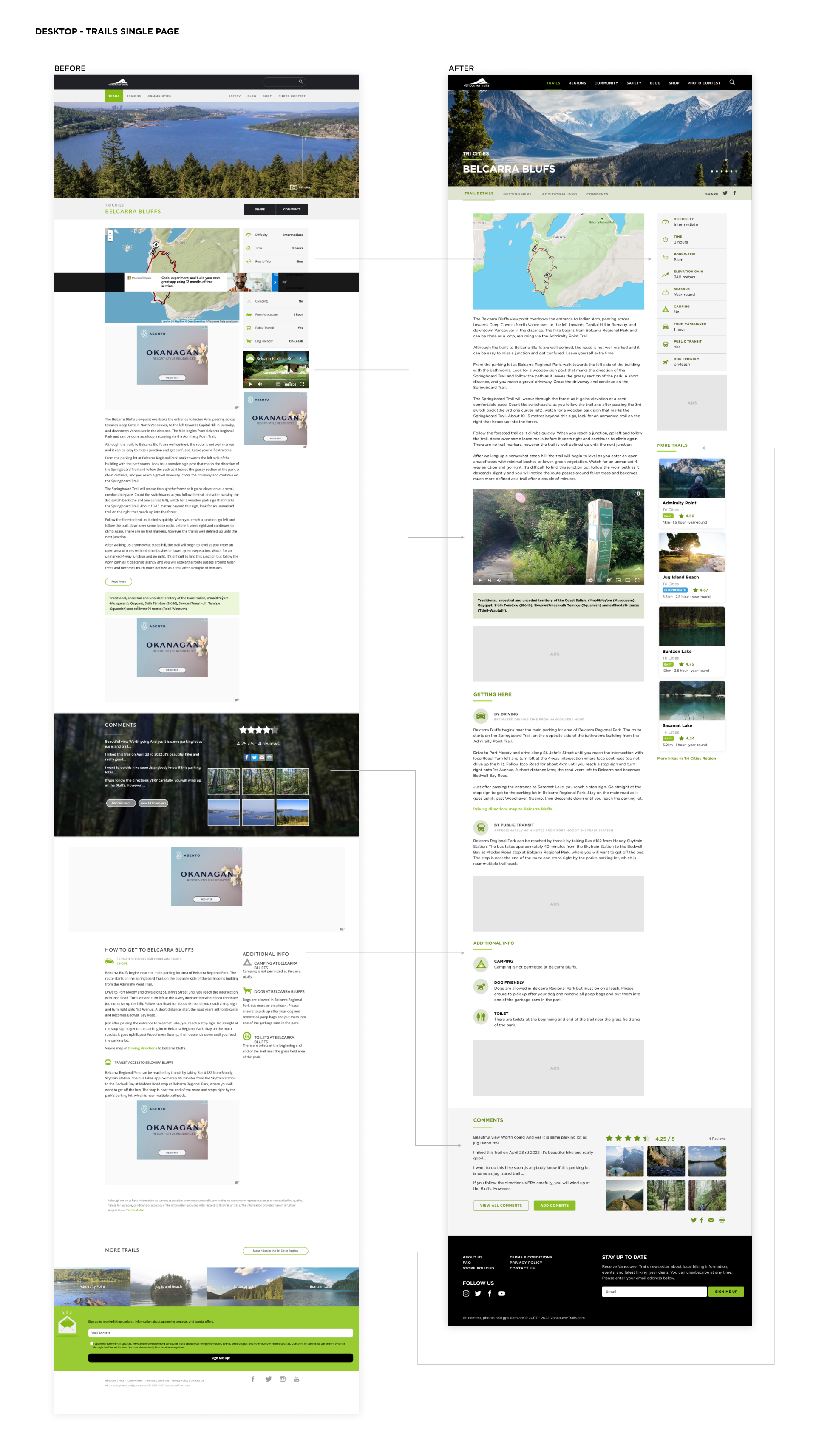
I added tab menu of the content so that when users click on the tab, it will direct to the correspondence content. I also changed the flow of the content to top and bottom rather than left and right, so that users will see it as a whole. I reorganized the content order, such as; moving ‘Comments’ to the bottom of the page and removing the background image to improve readability, moving ‘More Trails’ to the side and making it dynamic so that when users scroll, it will keep showing on the side.
Region
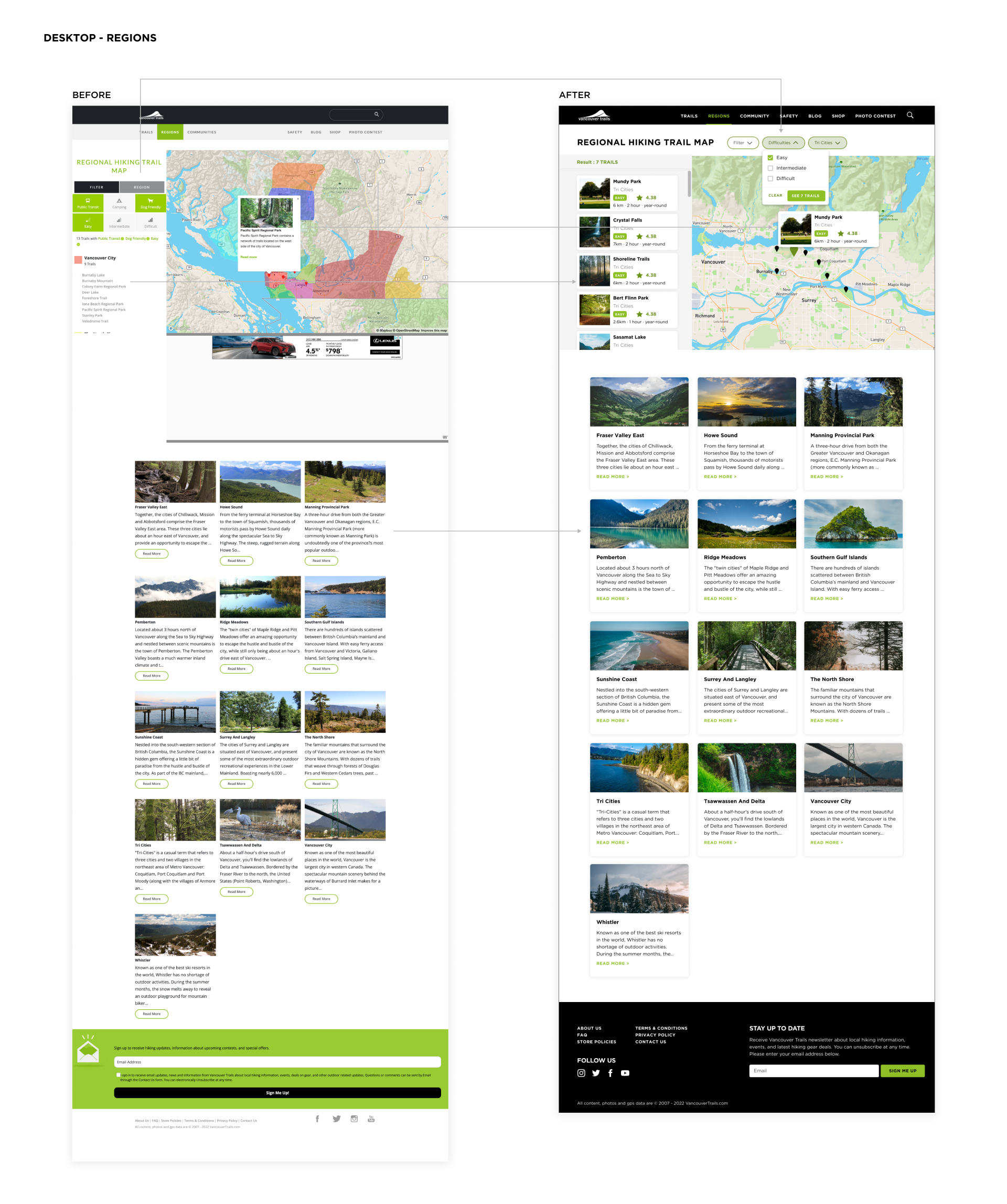
I moved the filter and the page title to the top of the page to separate them from the filter result. The area of the result will have a fixed height and users can scroll down to see the result. Instead of the name of the trail only, I created trails card with image and other important info. The content is the same as the card on the trail page but different orientation to save space.
New Mobile Website Design
